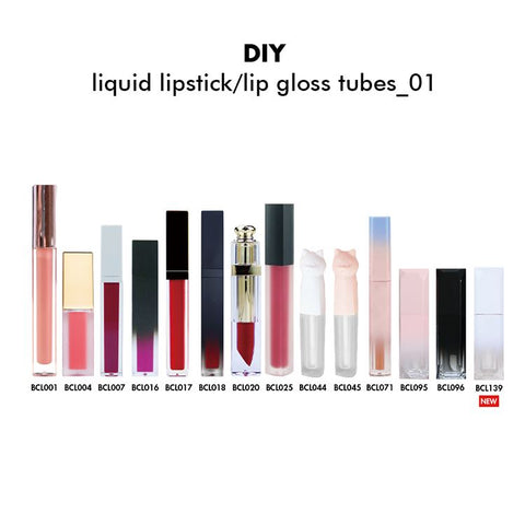


-
LGN01
-
LGS02
-
LGS03
-
LGS04
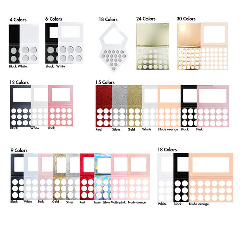
- + 30
-
MSF05029Z_01
-
MSF05029Z_02
-
MSF05029Z_03
-
MSF05029Z_04
- + 1
-
MSL05019 01
-
MSL05019 02
-
MSL05019 03
-
MSL05019 04
- + 1
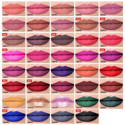
-
DLN01
-
DLN02
-
DLN03
-
DLN04
- + 35


-
DLN01
-
DLN02
-
DLN03
-
DLN04
- + 26
Farbtheorie für Maskenbildner
Farbtheoriemodelle
Es gibt verschiedene Modelle der Farbtheorie, aber hier sind die drei, denen wir täglich begegnen:
- Rot-Grün-Blau-Modell (RGB) – wird in elektronischen Systemen verwendet, die Licht übertragen, wie z. B. Computer und Fernseher.
- Rot-Gelb-Blau (RYB)-Modell – das traditionell in der Kunst verwendete Farbsystem. Es existiert seit Jahrhunderten und wird häufig in der Schule gelehrt. (Neuere Experimente haben jedoch gezeigt, dass die wahren Primärfarben Magenta, Gelb und Cyan sind.)
- Magenta-Cyan-Gelb-Modell – ein modernerer Ansatz zum Malen und das von Druckern verwendete Modell. Diese Farben mischen ein helles und sauberes Spektrum.
Wir verwenden das RYB-Modell, da es den meisten Leuten bekannt ist und sich leicht für Make-up und Frisuren verwenden lässt. 
Der Farbkreis
Zu wissen, wie man eine bestimmte Farbe erzielt und zu verstehen, welche Farben sich gegenseitig aufheben, ist beim Schminken und Frisieren von entscheidender Bedeutung.
Der Farbkreis bietet eine einfache Möglichkeit, die grundlegende Beziehung zwischen den zwölf darauf abgebildeten Farben zu betrachten. Außerdem wird in einfachen Worten erklärt, wie man Farben mischt, um neue Farben zu erzeugen.
Unten sehen Sie den Farbkreis „Rot Gelb Blau“, der die zwölf Farben zeigt, die in die Gruppen PRIMÄR, Sekundär und Tertiär (die kleinste Schriftart) unterteilt sind.

Primärfarben
- Rot, Gelb und Blau sind die Primärfarben.
- Wenn zwei Primärfarben gemischt werden, entsteht eine Sekundärfarbe. Rot und Gelb ergeben Orange. Gelb und Blau ergeben Grün. Blau und Rot ergeben Violett.
- Mit den Primärfarben können Sie praktisch jede andere Farbe im Spektrum mischen. Daher ist es wichtig, die Farbtheorie zu kennen.
- Wenn alle drei Grundfarben miteinander vermischt werden, entsteht Braun. Verschiedene Brauntöne entstehen durch Mischen der Grundfarben in unterschiedlichen Proportionen.
Sekundärfarben
- Orange, Grün und Violett sind die Sekundärfarben im Farbkreis. Sie entstehen durch Mischen gleicher Mengen zweier Primärfarben.
- Durch das Mischen unterschiedlicher Anteile zweier Primärfarben entstehen Variationen einer Sekundärfarbe. Mischt man beispielsweise gleiche Mengen Rot und Gelb, entsteht ein „klassisches Orange“, wie es im Farbkreis zu sehen ist. Mischt man jedoch etwas mehr Rot in ein Gelb, entsteht ein dunkleres Orange.
Tertiärfarben
- Zinnoberrot, Bernstein, Chartreuse, Aquamarin, Indigo und Violettrot sind Tertiärfarben.
- Sie entstehen durch die gleichmäßige Mischung einer Primärfarbe mit einer benachbarten Sekundärfarbe. Beispiel: Eine 50:50-Mischung aus Rot (Primärfarbe) + Orange (Sekundärfarbe und Nachbarfarbe von Rot) ergibt Zinnoberrot.
- Die Bezeichnungen für Tertiärfarben können variieren. In unserem Farbkreisdiagramm haben wir jedoch bekannte Namen verwendet.
Erstellen anderer Farben

Harmonisierende Farben
- Farben, die eine gemeinsame Grundfarbe haben, heißen harmonisierende Farben. Blau, Indigo und Violett beispielsweise sind harmonisierende Farben, da sie alle Blau als Farbbestandteil haben. Ebenso sind Grün, Chartreuse und Gelb harmonisierende Farben, da sie alle Gelb haben.
- Da sie eine gemeinsame Grundfarbe haben, verschmelzen sie problemlos miteinander.

Wie man Farben beschreibt
Bei Farben geht es um mehr als nur die richtige Mischung und den gewünschten Farbton. Wie ein Make-up vor der Kamera wirkt, hängt von vielen weiteren Faktoren ab. Um das besser zu verstehen, betrachten wir einige der Eigenschaften jeder Farbe und etwas später, wie wir Farben wahrnehmen.
Farben können anhand verschiedener Eigenschaften beschrieben werden, darunter Farbton, Helligkeit und Sättigung. Wir betrachten auch Farbtöne, Schattierungen und Töne.
Farbton
Vereinfacht ausgedrückt ist Farbton ein anderes Wort für Farbe. Er bezieht sich im Allgemeinen auf die dominante Wellenlänge der Farbe, wie sie im Farbkreis zu sehen ist. Beispielsweise ist der Farbton von Königsblau oder Marineblau Blau. Der Farbton von Smaragdgrün oder Saftgrün ist Grün. Der Farbton von Burgunderrot ist Rot.
Sättigung
Die Sättigung gibt an, wie „bunt“ eine Farbe unter bestimmten Lichtverhältnissen wirkt. Sie gibt an, wie intensiv die Farbe wahrgenommen wird.
Nehmen wir zum Beispiel ein beliebiges Make-up. Bei Tageslicht sieht es anders aus als bei Nacht. Tagsüber sind die Farben heller, nachts wirken sie jedoch grau oder verblasst. Das Make-up ist genau dasselbe, die Farben haben sich nicht verändert. Allerdings hat sich die Sättigung geändert, wodurch wir die Farben anders wahrnehmen.
Je gesättigter eine Farbe ist, desto lebendiger ist der Farbton. Um die Sättigung einer Farbe zu reduzieren, fügen Sie entweder Grau oder die Farbe auf der gegenüberliegenden Seite des Farbkreises hinzu. Dadurch wird die Farbe „ausgegraut“ oder „ausgewaschen“. Eine ausgegraute Farbe gilt als entsättigt.
Helligkeit oder Wert
Helligkeit oder Wert beziehen sich im Wesentlichen auf die Lichtmenge, die von der Farbe reflektiert wird. Kurz gesagt, beschreibt es, wie hell oder dunkel die Farbe ist.
Beispielsweise ist Bananengelb heller als Senfgelb und Rosa heller als Dunkelrot. Daher kann man sagen, dass Gelb und Rosa einen höheren Wert (heller) haben als die anderen Farben, die einen niedrigeren Wert (dunkler) haben.
Farben mit einem hohen Wert werden von uns vor Farben mit einem niedrigeren Wert wahrgenommen. Unser Auge wird stärker von helleren Farben angezogen, weshalb wir sie verwenden, um ein Make-up hervorzuheben. Ebenso wird eine Farbe mit einem niedrigeren Wert als zurücktretend bezeichnet, und wir verwenden diese, um Tiefe und Schatten zu erzeugen.

Farbton
Ein Farbton ist einfach eine Farbe plus Weiß. Daher wird die Farbe dadurch heller.
Mischt man beispielsweise Weiß mit Violett, entsteht Flieder. Mischt man Weiß mit Blau, entsteht Hellblau. Pastellfarben wie Pfirsich, Apricot und Creme sind Farbtöne.
Schatten
Ein Farbton ist einfach eine Farbe plus Schwarz. Dadurch wird die Farbe dunkler.
Wenn Sie beispielsweise Schwarz zu Violett hinzufügen, erhalten Sie ein dunkles Purpur. Wenn Sie Schwarz zu Blau hinzufügen, entsteht ein eher marineblauer Farbton.
Ton
Ein Ton ist einfach eine Farbe plus Grau. Daher wird die Farbe dadurch grauer und dunkler.
Die Tonalität gibt an, wie hell oder dunkel eine Farbe ist. Wenn Sie einer Farbe kontinuierlich etwas Grau hinzufügen, entsteht ein Farbtonverlauf.
Der Ton ist besonders wichtig in der Schwarzweißfotografie, da man eher Töne als Farben sieht. Beispielsweise könnten ein helles Orange und ein helles Blau die gleiche Tonalität haben und daher auf Schwarzweißfilm gleich aussehen.

Beispiel-Block-Zitat
Praesent vestibulum congue tellus bei fringilla. Curabitur vitae semper sem, eu convallis est. Cras felis nunc commodo loremous convallis vitae interdum non nisl. Maecenas ac est sit amet augue pharetra convallis nec danos.
Beispiel Absatztext
Praesent Vestibulum congue tellus bei Fringilla. Curabitur vitae semper sem, eu convallis est. Cras felis nunc commodo eu convallis vitae interdum non nisl. Maecenas ac est sit auguste pharetra convallis nec danos dui.
Cras suscipit quam et turpis eleifend vitae malesuada magna congue. Damus id ullamcorper neque. Sed vitae mi a mi pretium aliquet ac sed elitos. Pellentesque nulla eros Accumsan quis justo tincidunt lobortis denimes loremous. Hängen Sie das Vestibulum lectus in den Lectus volutpat ein, bis es zum Purus pulvinar kommt. Vestibulum sit amet auctor ipsum.